
Wednesday, 19 December 2012


Tuesday, 11 December 2012
Process of creating First Draft of Front Cover
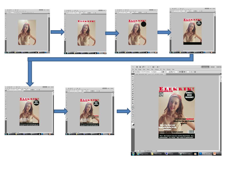
Above I have shown the process of how I created the front cover magazine and I have printscreened each part of the creation process, which has given me the first draft of my Magazine front cover.
Draft 1 of Magazine Front Cover

Above is the first draft of my magazine I have have quickly analysed a few of it's features and have also highlighted a few things which I could improve on in the next few drafts.
Monday, 10 December 2012
Practice shots of front cover images

This is a medium close up from a low angle, I think the darkness of the colours that can be seen in this image look really good, however I think the fact that you can see the light bulb above her head slightly ruins the effect, I think this would have looked better if I had taken this image from a lower angle meaning that the lightbulb would have been behind the model and the light would still have been seen and would in fact just make the image of the model stand out and look better.

Again this is very similiar to image above and again, the image is darker, this could again be another thing I don't like about this image because you can't really see the details in the models face and the picture would look very dull if it was put on the front cover of a magazine.

This is a medium shot of the model and I like this image because the lighting is just right, it highlights certain parts of her face and makes her eyes stand out, this would be good for a front cover image because the reader would automatically make eye contact with the model this would instantly establish a relationship with the reader and therefore would make the reader want to pick up and buy the magazine.

This is a medium shot from a high angle, this would be a good front cover image because the lighting isn't to dark or to bright. The way that it's from a high angle tackles the steroetype of the "rich, famous, perfect" model and makes the model seem like more of an average girl, meaning more people would relate with her and read the magazine. The one thing that I would do is perhaps give her some kind of prop to hold and also maybe rethink her outfit, to make it fit the rock/indie stereotype.

This is a good image for a front cover image because the model appears to be very confident, and since she is supposed to be a singing artist, the reader would be able to immediately recognise her because it is a clear shot of her that doesn't distort the image at all, despite this I think that she needed to be wearing something a little bit darker to fit in with the genre of the magazine, for example a leather jacket or a dark coloured dress.

In this shot above, I think that the


I think this image didn't look right because it was blurry, and theres no way that anyone could actually properly see who she was just through that image.


Subscribe to:
Posts (Atom)